What is diversity in photography?


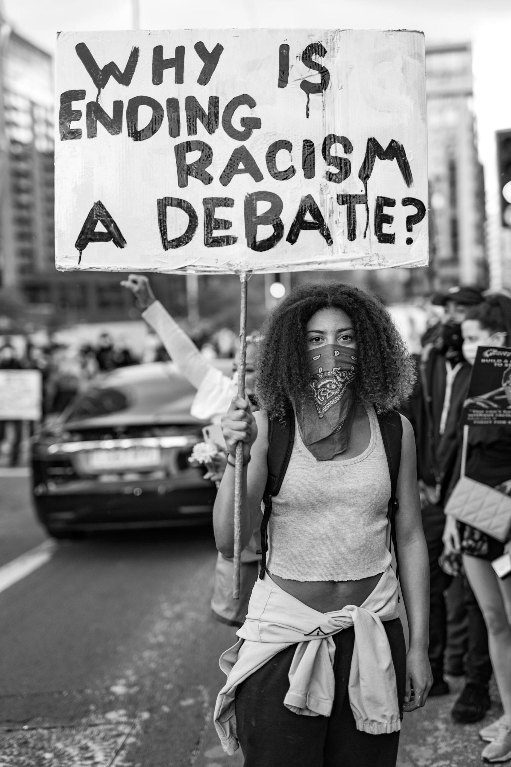
Diversity can be presented within the world of photography through the inclusion of people from varied backgrounds, cultures, ages, genders and body types to reflect the world in its truest form. This can challenge stereotypes that certain members of the audience may believe in, bringing us beyond homogeneity to create visuals that reflect the growing inclusive nature of the 21st century. These images can contain or reflect stories that resonate with people of different backgrounds, creating a wide range of valid responses based off the wider audience’s experiences. The representation of these cultures within the images is more authentic than the usual stereotypical representations that some members of the audience may be used to experiencing. This allows people to feel represented and to be able to see themselves within media which can also challenge biases by normalising differences between cultures. Overall, diversity is important within photography as it can bring wider audiences together and fight against damaging stereotypes.
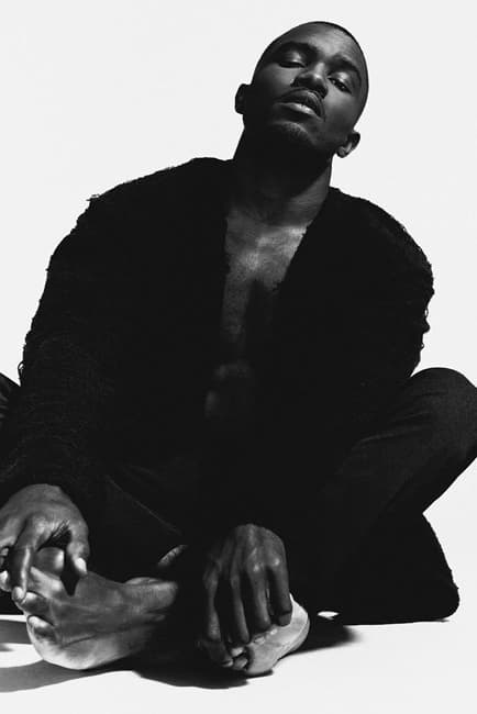
Nabil Elderkin
Nabil Elderkin is an American-born Australian film and music video director and photographer. I knew about his work already due to his involvement in directing videos for artists such as Kanye West, Frank Ocean, Kendrick Lamar, John Legend and Arctic Monkeys to name a few. His photography portfolio is very impressive, conducting studio shoots for many of the artists that I listed that they have used for either magazine covers or promotional imagery for their albums. He became well-known after Kanye had just got signed to Roc-A-Fella Records and Nabil owned the domain name for Kanye West due to his belief that he would become a big artist one day. He transferred this domain name under the agreement that he could conduct a photoshoot for him, during this shoot John Legend was also present which sparked their friendship. Overall, I am a huge fan of his work as I love how all of his work has his signature style or his approach to it.
The image on the far right features Frank Ocean and was taken as part of a studio session between the two of them. The use of the black and white imagery creates much greater contrast between the highlights and shadows which creates depth within the image. It also makes the image feel more moody as we can only just make out some of the features in his face due to the light hitting it at an angle. The model takes up most of the frame, leaving little to no negative space surrounding them which draws the audience’s attention directly to them as the subject. They are also in the centre of the frame and their clothing makes them stand out from the background. These help us to keep our eyes on the subject and understand that perhaps they feel as though they don’t quite fit into the modern day society due to the harsh contrast in the colours. Overall, I really like this image as it feels like it was taken at a vulnerable moment where they are sat on the floor with their legs crossed. It makes us question what they were doing or what has happened to make them want to present themself like this.


Robin Hammond
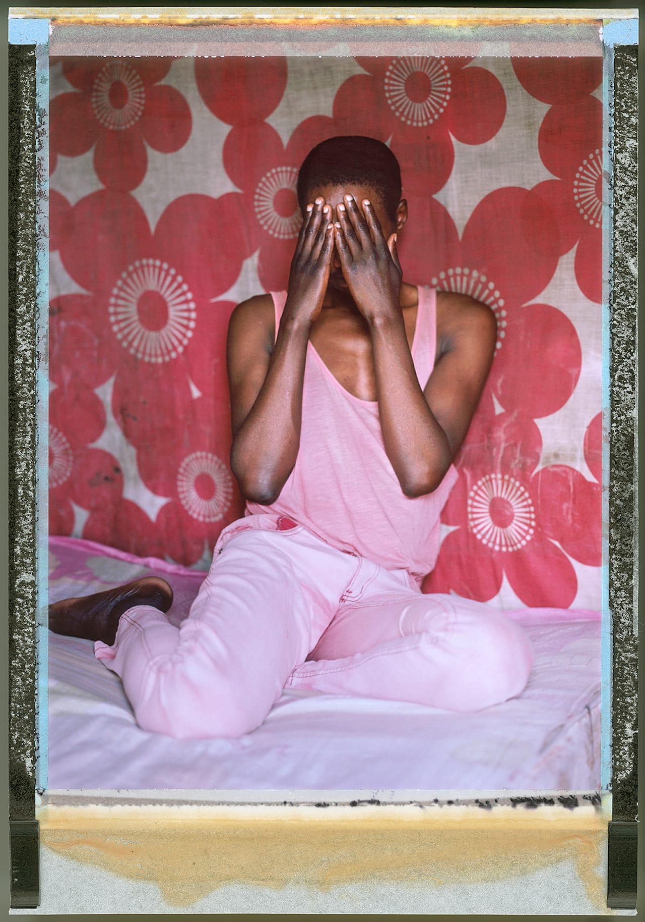
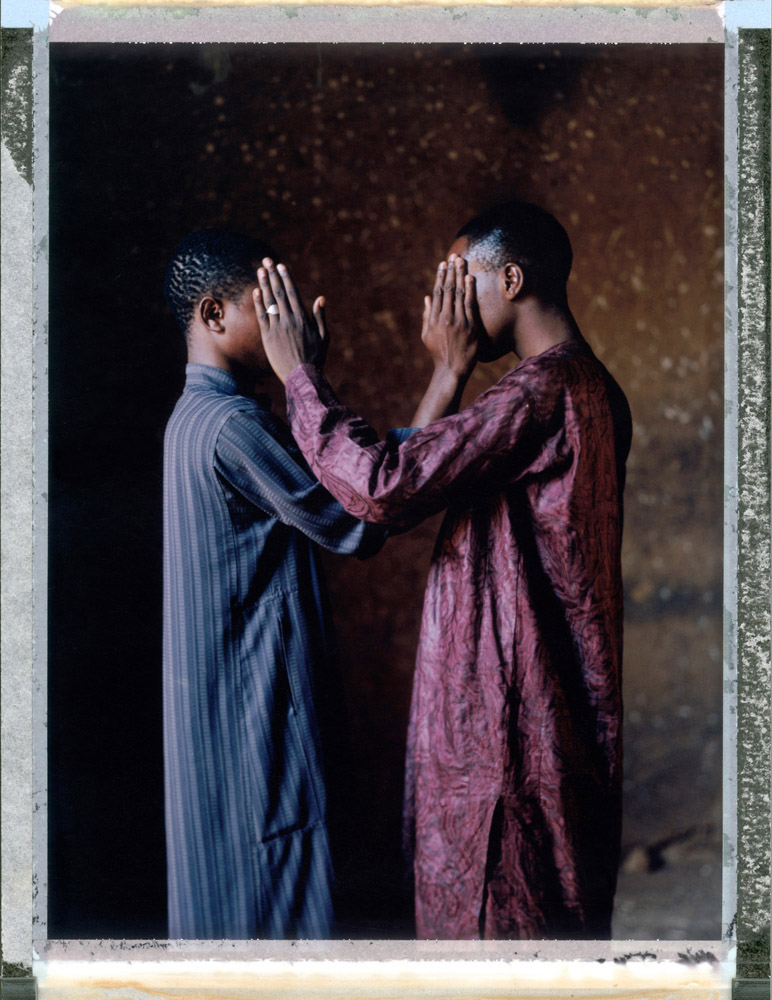
Robin Hammond’s career has been dedicated to showing off the lives and narratives of marginalised groups through visual story telling projects. One of his projects ‘Where Love Is Illegal’ focuses on the discrimination against the LGBTQI+ community around the world. It has become very popular on social media and has even been exhibited around the world and featured in many large scale publications such as when it was on the cover of Time Magazine and in National Geographic. He also features on subject matter such as mental health in his work titled ‘In My World’ and has been used to influence governments to consider the rights of vulnerable members of society. He is now a National Geographic Explorer and photographer that contributes to them highly. Overall, I really like his work as it is clearly something he feels very deeply about. It has a strong meaning behind it all and it has been used for good which is what art and photography is for in my opinion.
The image in the middle features 2 men who are clearly in a romantic relationship. They are covering each other’s faces which creates an emotional image as they both clearly understand that their love for each other is not allowed or is frowned upon in many parts of the world so they are having to hide their relationship. The shallow depth of field makes us focus on just them, making them stand out from their dull background. They are standing in a way that feels reminiscent of a wedding photo, however this image is nowhere near like what a wedding photo is as they are both clearly ashamed of who they truly are. This makes it upsetting for the audience as there is still a lot of discrimination and hate within the world as some people are too blinded by their ignorance to let other people live their lives how they want to be. Overall, I find this image to be very engaging and very inspiring as these topics are things I feel connected to, especially with the growing hate and discrimination in today’s society with the far right political parties becoming more popular to idiots.
My Work
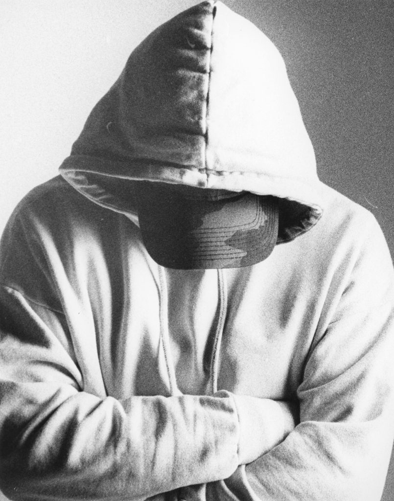
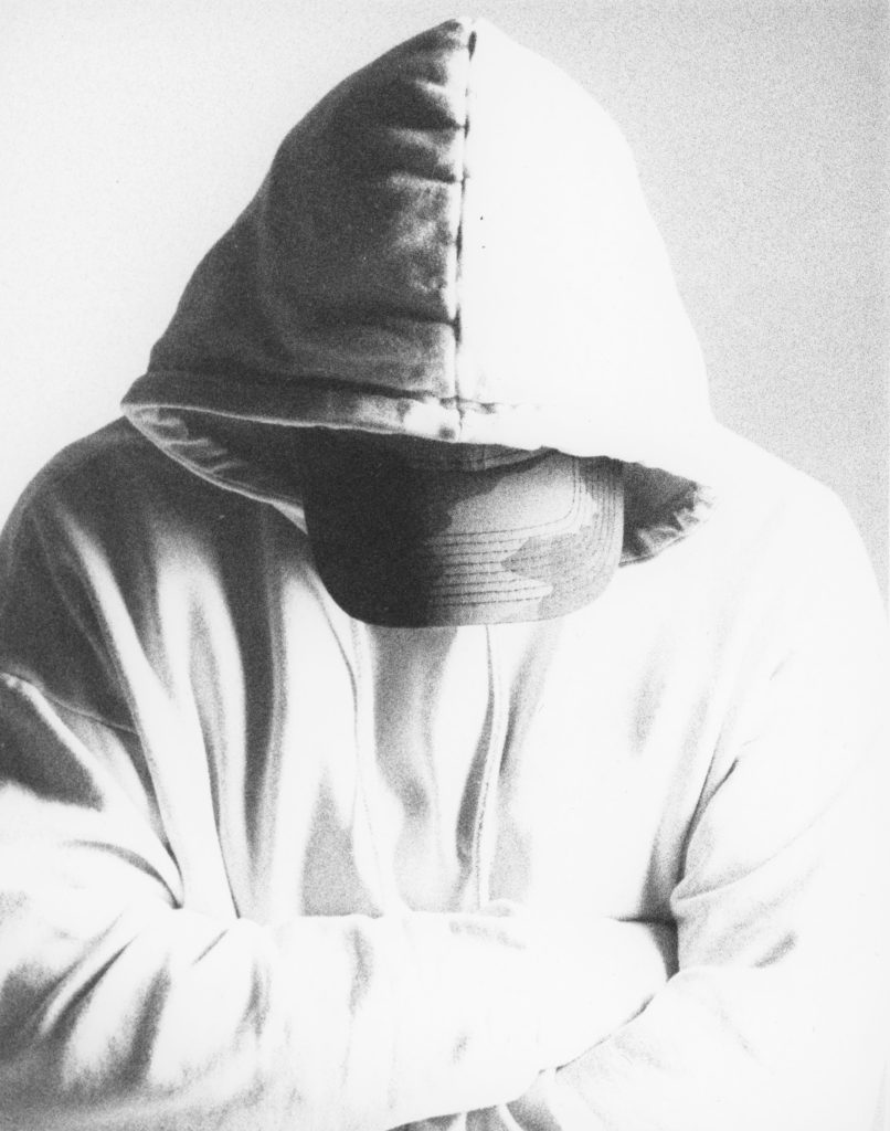
This image was taken as a part of a self portrait photoshoot in the studio on ISO 400 film. I wanted to reflect feelings of isolation and locking yourself away from others whilst you perhaps need help and need to talk to people about your emotions. The cap down and hood up completely masks my identity and stops me from being visible at all. This image was lit using a harsh split lighting which over-exposed one side of the image, causing the subject to blend into the background. To prevent this from being an issue, when I printed my final image, I used dodge and burn to burn in extra detail on the lighter side of the image. To do this, I got a large sheet of card and held it over the section I wanted to burn. I then moved it gently from side to side to feather the edges so there was no obvious line where I had exposed part of the image for longer. I did this for an additional 50 seconds on f/8 on top of the 55 seconds on f/11 that the whole image had already been exposed for. This was enough to bring in detail on the side of the image, creating more of a contrast and stopping that whole side of the image from blending into the background. Overall, I enjoyed this process and the whole process of printing in the darkroom and I am happy with the final outcome from this image after using the burn technique on it.