What is a diptych?
A diptych is an artwork created of two individual parts that work together to create a greater piece. Historically, these were painted on two panels that had been crafted together by hinges. They were used as a form of showing wealth, class and family, as they contained images of loved ones. They could be sealed like a book for protection and security. The use of the diptych in photography can combine separate subjects together, finding some relation through the use of form, colour, lines or light. It can be an interesting way of looking at subjects, creating new meanings for the audience and changing how they look at certain subjects. The presentation of these images together can alter the narratives of the images, making them more engaging to look at.


What is image and text?
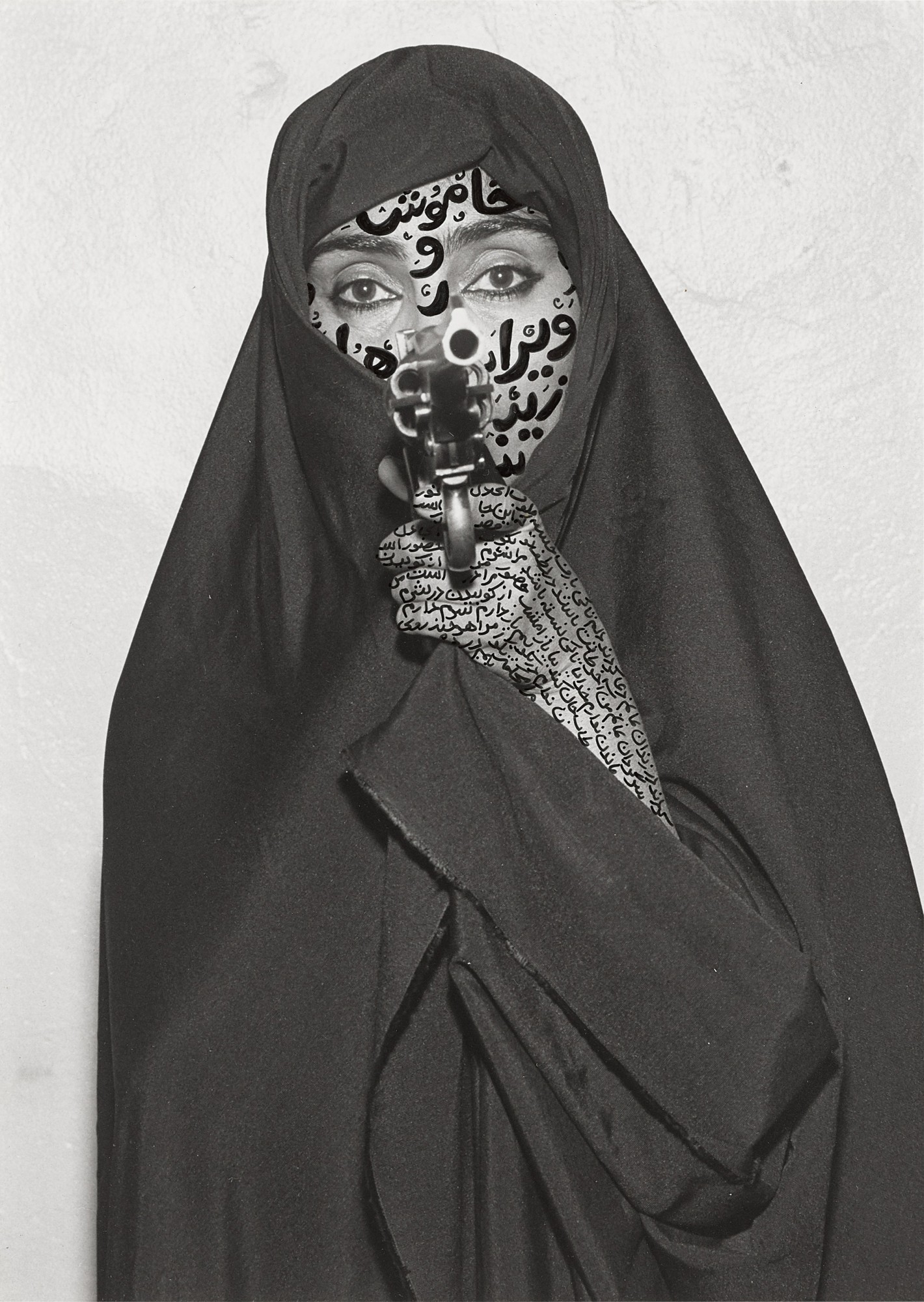

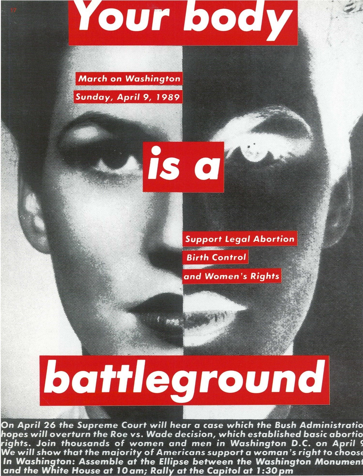
Image and text is what it says, the presentation of an image with text over or alongside it. This can be used to change the narrative of an image or to add extra information for the audience so that they further understand the context of the image. The image is a way of demonstrating the story visually, while the text provides a written or narrative explanation. This makes it much clearer for the audience as to what is going on within the world of the image. These can come in the form of an advertisement or image in a newspaper or magazine, a marketing poster or just experimental photography, bringing 2 narrative functions together. The text can both add to the narrative and can also change the way the audience read the image. The text within the image can also change the way the overall image looks. This can be by masking the subject or by using the text as a way of framing a subject etc.
Shirin Neshat
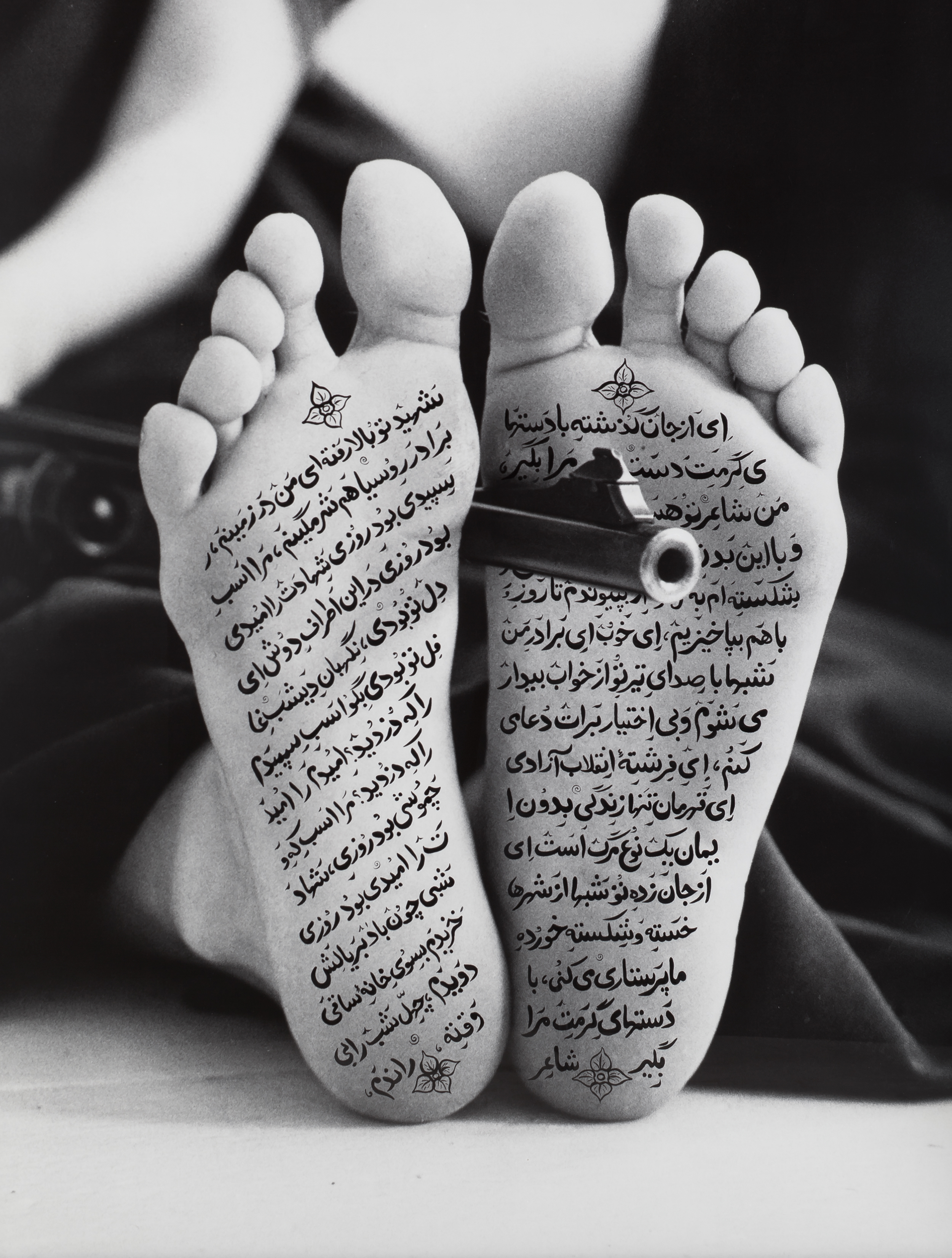
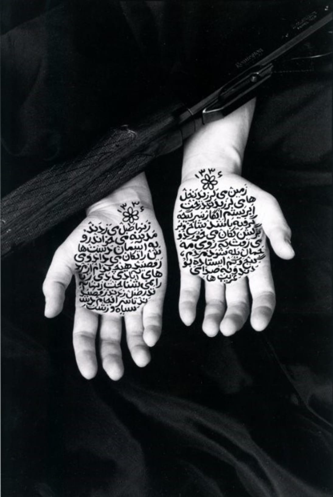
Shirin Neshat is an Iranian photographer and visual artists who moved to live in New York City. She is most known for her work featuring contrasts between Islam and the West as well as femininity and masculinity. Her work addresses the problems and issues that women face within modern Islamic societies as she herself actively resists stereotypes faced within Islam. She uses religious imagery alongside Persian scriptures to make her statement on the unfair treatment of women within contemporary Islamic life. She also uses regular imagery of weapons such as guns which completely contradict how women in some Islamic societies are viewed as they can be seen as weak and even sometimes useless. The guns are obviously very powerful and make the women photographed look, in a way, more powerful than the men within these societies. Overall, I am a big fan of her work as I agree with the messages she is conveying through her images as the poor and unfair treatment of women is not acceptable, especially in today’s society.
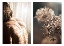
In the image on the far left, the centrally framed subject and contrasting colours draws the audience’s attention to the woman’s face in the centre of the frame. The scripture over her face also contrasting with her skin colour makes it much more eye catching as the audience can visibly notice that it is there and, even if they can’t read it, it gives them a deeper understanding on who this woman might be and what she might be doing etc. The use of the gun going along the middle of her face and directly in the centre of the frame could also be symbolic of the power that Neshat is overcoming to create these images as Iranian Women in this time were oppressed by the Men. Overall, I really like this image as it has a lot of meaning behind it and her use of multimedia editing is very powerful in this case.

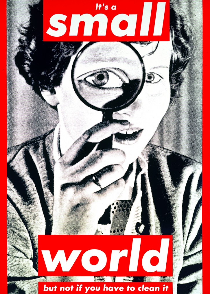
Barbara Kruger
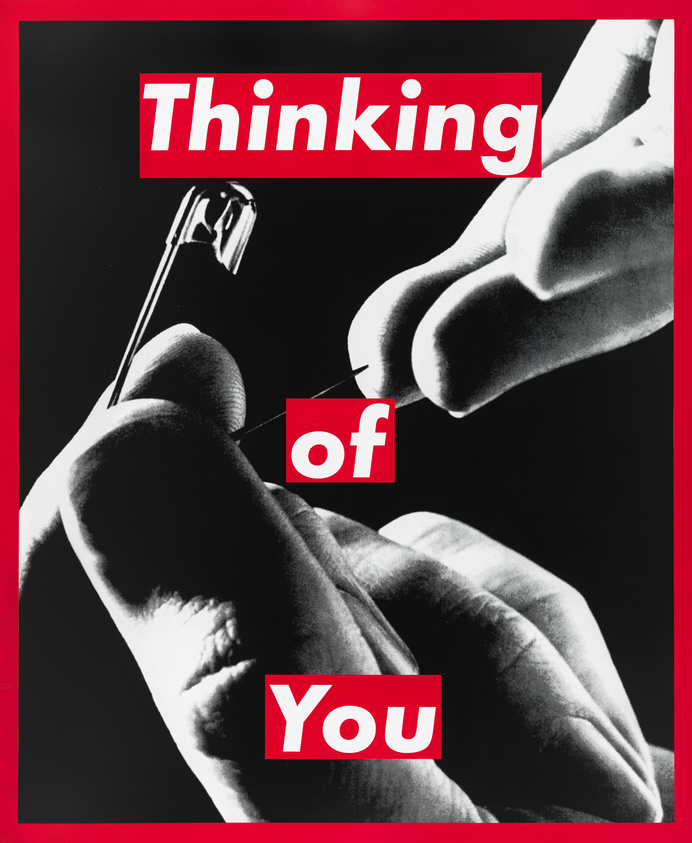
Barbara Kruger is an American conceptual artist and collagist who is known for her work that features black and white photographs alongside bold, newspaper headline style text. This text could be seen as the image’s caption and is always written in a bold white-on-red font somewhere within the image. Her work often features pronouns that directly address the audience, making them consider or reflect upon their own personal identity and their place in the modern day society. Her artistic mediums include photography, sculpture work, graphic design, architecture, and also video installations. Her work is often created with a feminist view-point in mind as she makes statements about the unfair treatment of women and stereotypes about women being not as good as men in society. Overall, I really like her work as it reminds me of some pop art such as Andy Warhol through its use of bold, vibrant text and somewhat basic imagery.
The image in the middle uses bold text and an image border to frame the subject within a window that is reminiscent of a newspaper article. The text could represent how women were seen as the ones who had to do all of the cleaning around the house, this is backed up through the image of the woman holding a magnifying glass, potentially hinting at the fact that women are better at these things than men. The subject’s eye is framed within the magnifying glass, potentially showing off her individual identity and how she is different to other women but they are all still treated the same anyway due to the sexist and unfair treatment of women in this time period. Overall, I really like this image as it feels like it has a strong message behind it, especially with when it was originally created and these struggles would have been much more prominent for women within society.
My Work
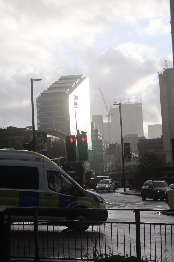
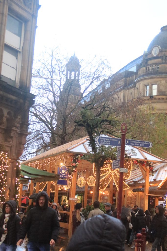
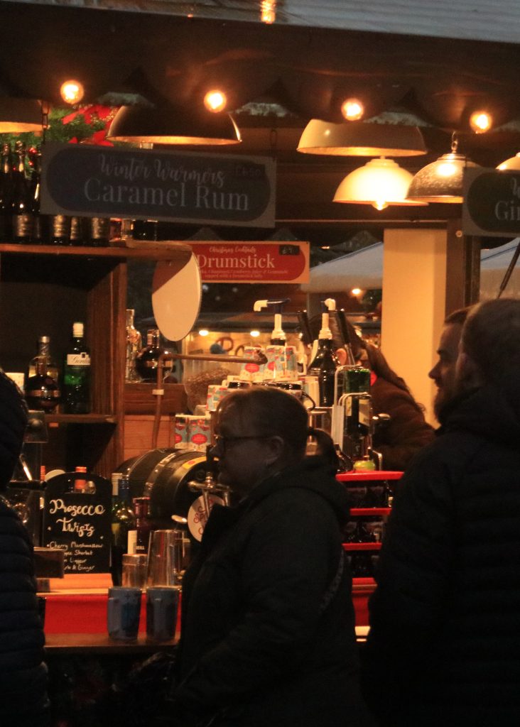
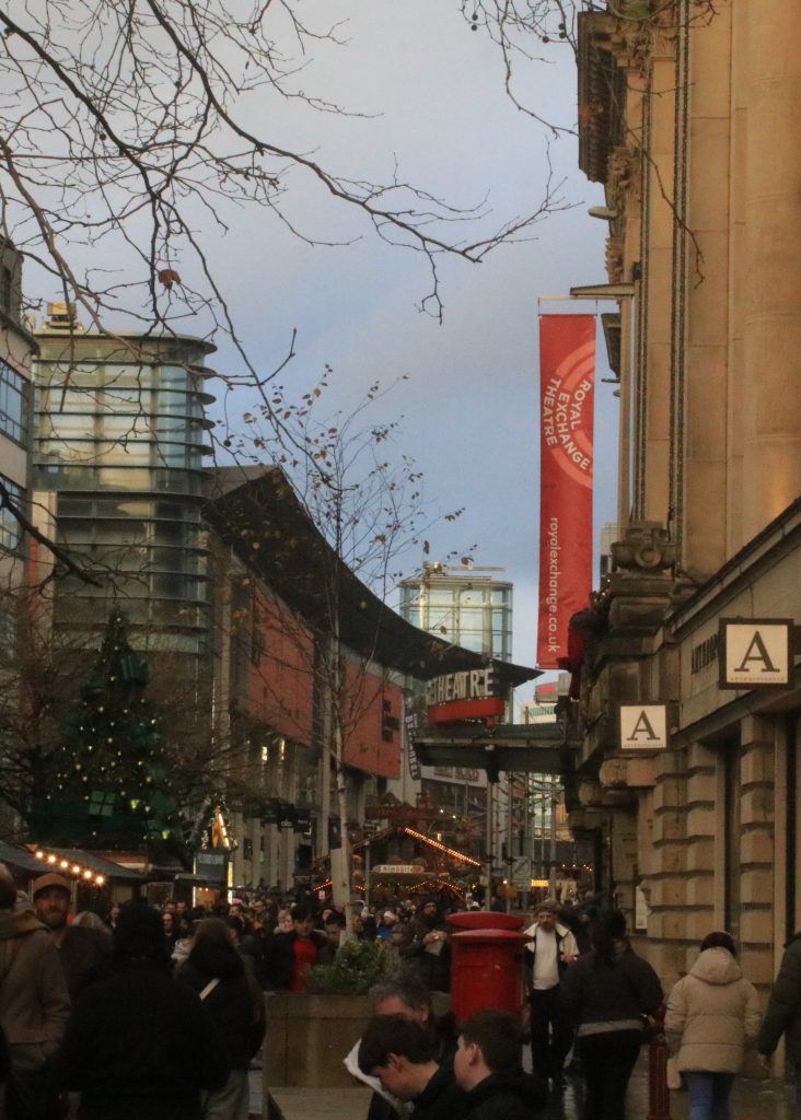
For this photoshoot, I went to the Manchester Christmas Markets. It was very dull and rainy day with impacted my images, leaving me with a lot of grainy images and the others had come out with water droplets on the lens causing them to be blurry in places. Because of this, I only ended up with my 2 final outcomes from this photoshoot as none of the other images were good enough to use. However, I had realised this and was planning on doing a second photoshoot to make sure I still had a wide range of images to use for this section. But on the build up to Christmas, I spent too much time in the studio on my self-portraits and in the dark-rooms developing my film and printing my best images. I then was left with only the Christmas break but I have been extremely busy doing the other parts of the work so I was left with no time to do any re-shoots. But, as I have already mentioned, I did manage to get some images so I have shown a selection of some of the best from the bad bunch. I really struggled to find any alliances between these images so I have displayed them as their own individual images. I did, however, manage to get my 2 final outcomes that I did find alliances within for my analysis to write about.
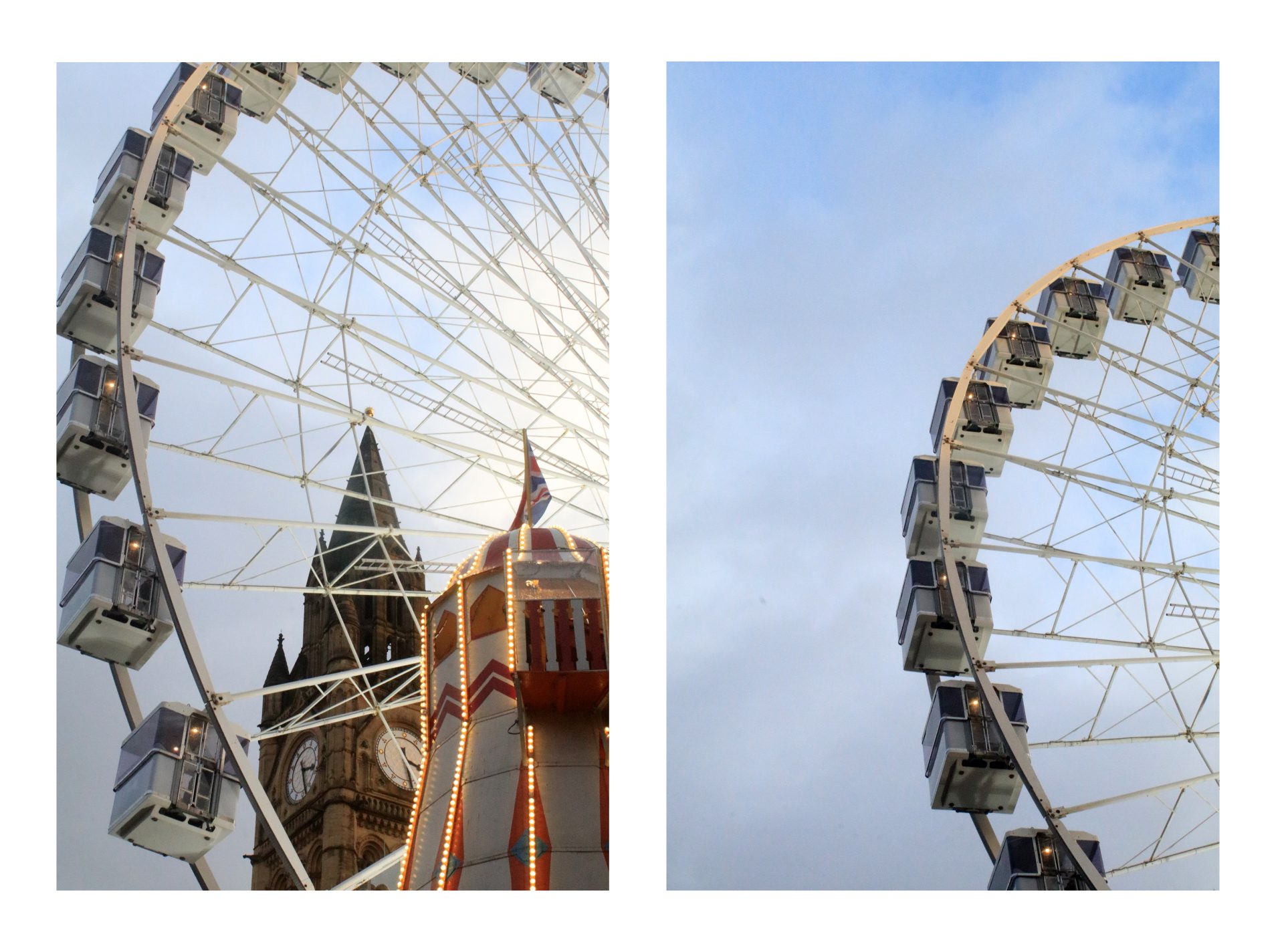
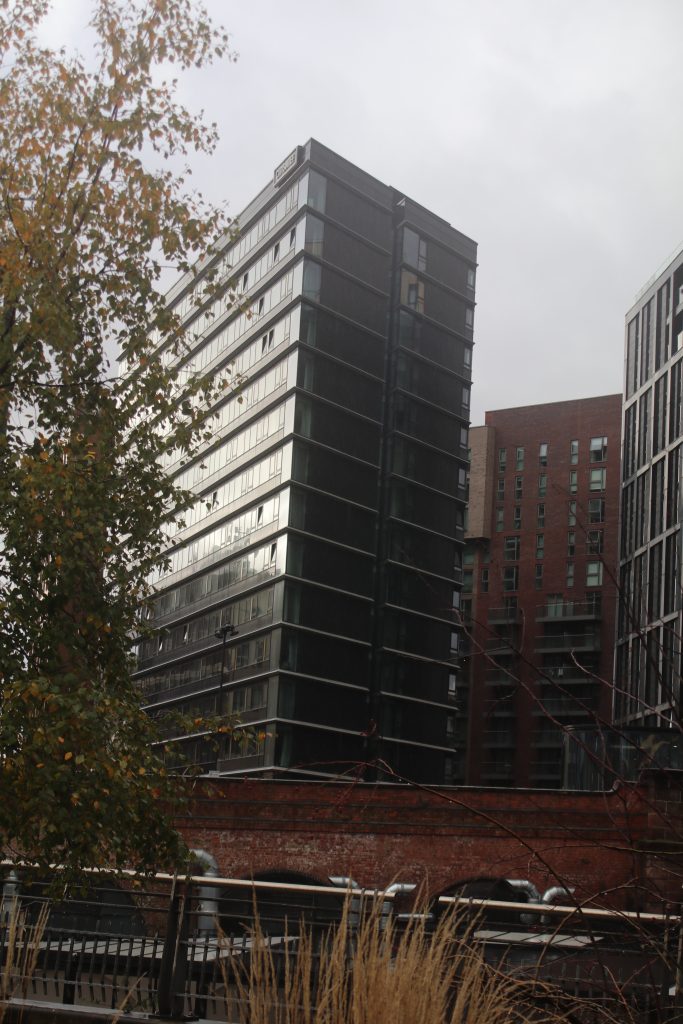
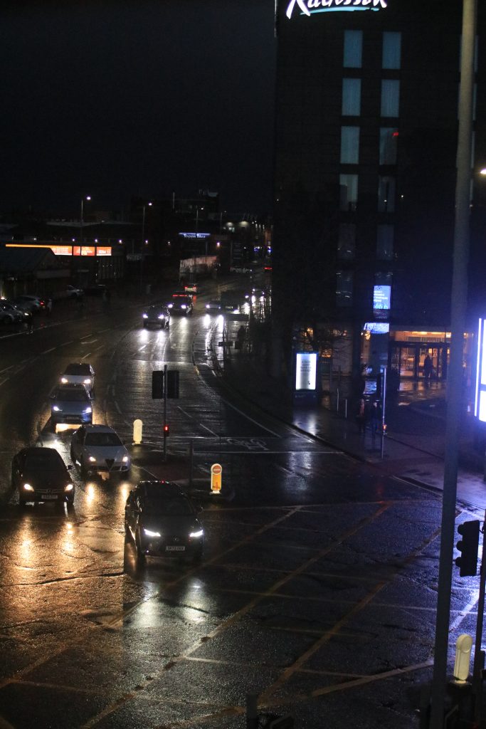
My Diptych titled ‘The Big 3’ was shot in the centre of the Manchester Christmas Markets surrounded by lots of interesting architecture alongside the typical Christmas Market huts and rides etc. I wanted to capture an image featuring 3 of the tallest buildings all in line with each other to make it reflect the business of the actual real life location. The second image within the diptych was a more minimalist approach to shooting just one of the buildings to make it feel emptier. In a way, I wanted to show what the area would be like without the Christmas traditions and how this time of year can bring people together. I am somewhat happy with this outcome as I like both of the images as individual images and I also like the message I was trying to reflect within them but I don’t feel that they are as unlikely as they could be. They both feature a subject that is the same in both images which makes it seem very plain and boring in a way.
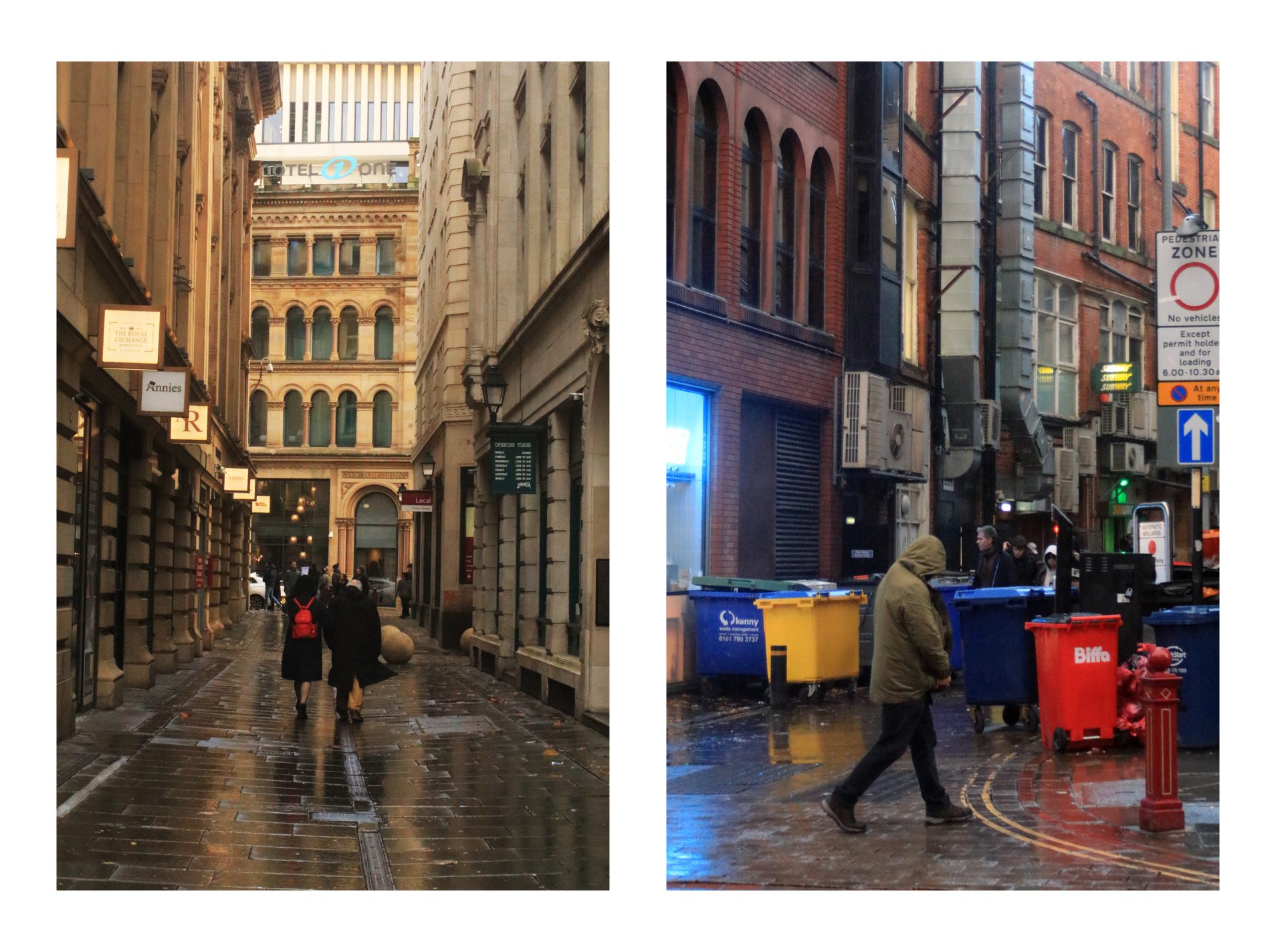
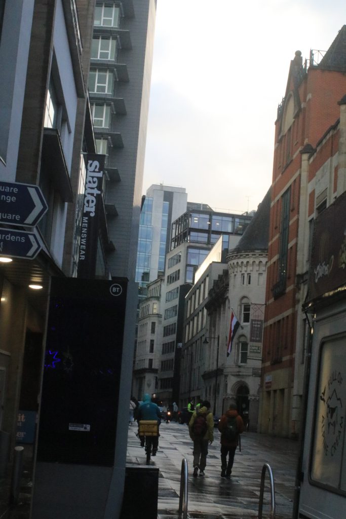
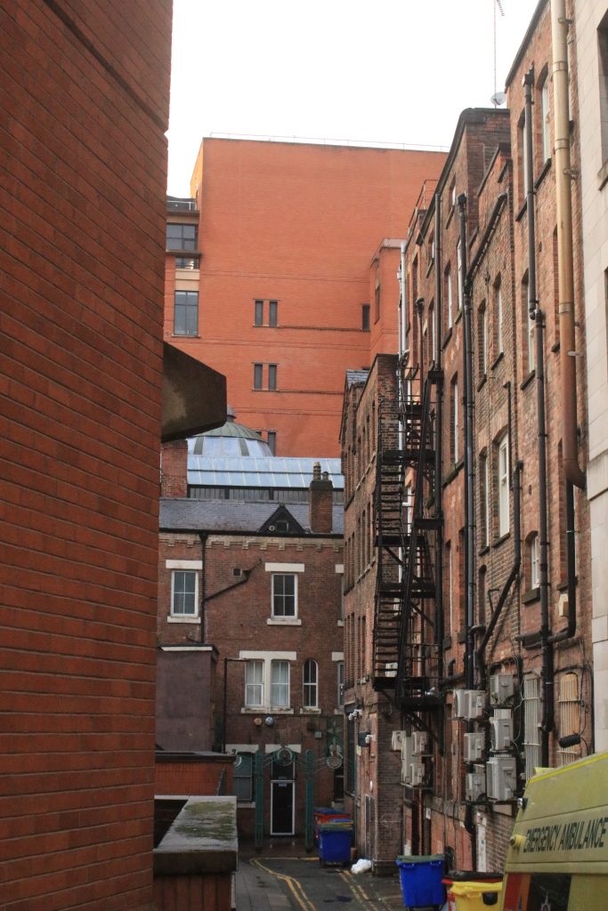
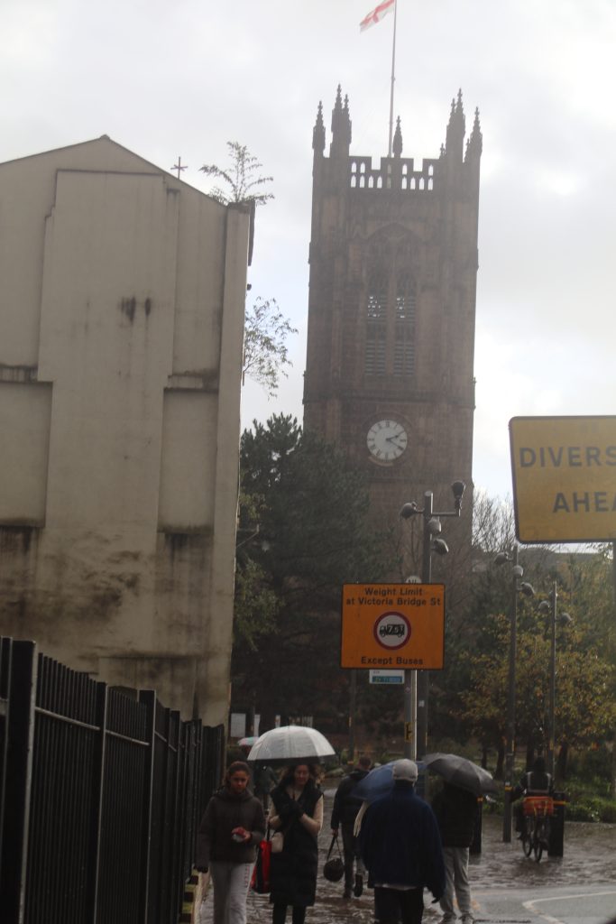
My second Diptych titled ‘Down the Alley’ features 2 completely different locations in the Manchester city centre. The first of which being a luxurious shopping centre with warm colours and a happy couple walking down through the centre of the frame. This image was taken to look ‘idealistic’ through its symmetry and architecture that is featured within it. Contrastingly, the second image is more all over the place as there is no symmetry. There is also a singular person walking alone within this location making it feel much more depressing. Also the fact that this image features much colder colours and a lot of bins within the frame makes it feel much less idealistic than the first image. I like these images in conjunction with each other as they show the duality of life and how quickly things can change or how within the same area, different people can be living totally different lives. This somewhat highlights the unfair economy of the country where the rich get richer and the poor get poorer.